VTS
NAVIGATION FOR DISCOVERABILITY
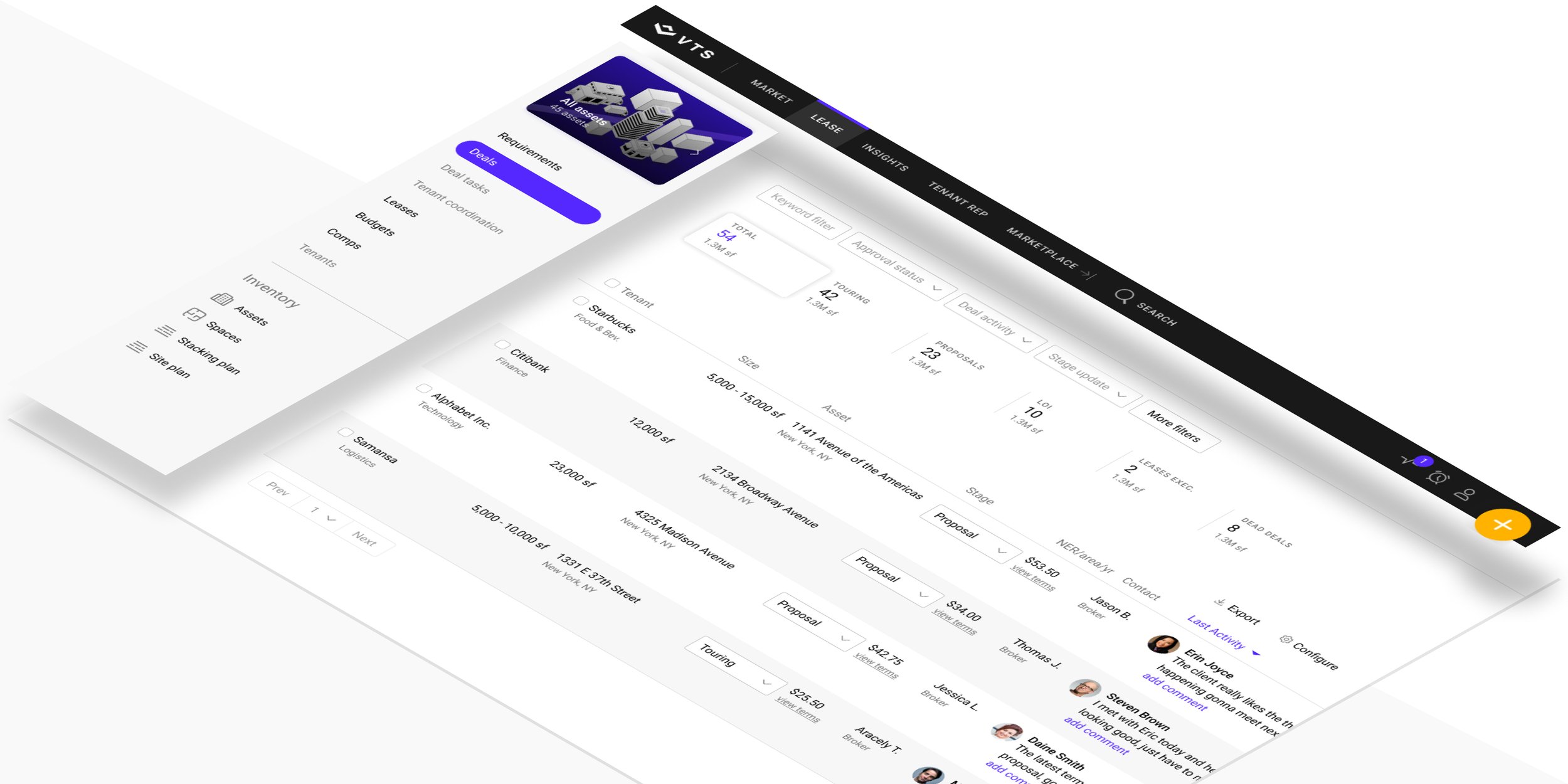
VTS — a leader in CRE tech used by over 75k leading institutinal clients.
UX Research / UI/UX Design / Creative Direction / Art Direction
As the product matured and scaled, it began to be apparent that it’s core information architecture was breaking. Overtime, through different channels of customer feedback, it had been communicated that way-finding and discovery was a challenge for our users.
TEAM
We are a small team that overseas the UX across the entire platform. We use a lean iterative design process to solve design problems.
My ROLE
UX Research / UI/UX Design / Creative Direction / Art Direction
CORE TEAM
Karen N. (PM), Maurice C. (Front End Engineer), Jace C. (Engineer), Daphne M. (Engineer), Evan T. (Engineer)
KEY STAKEHOLDERS
Nick R. (CEO), Korel O. (CPO), Heads of CS and AM teams
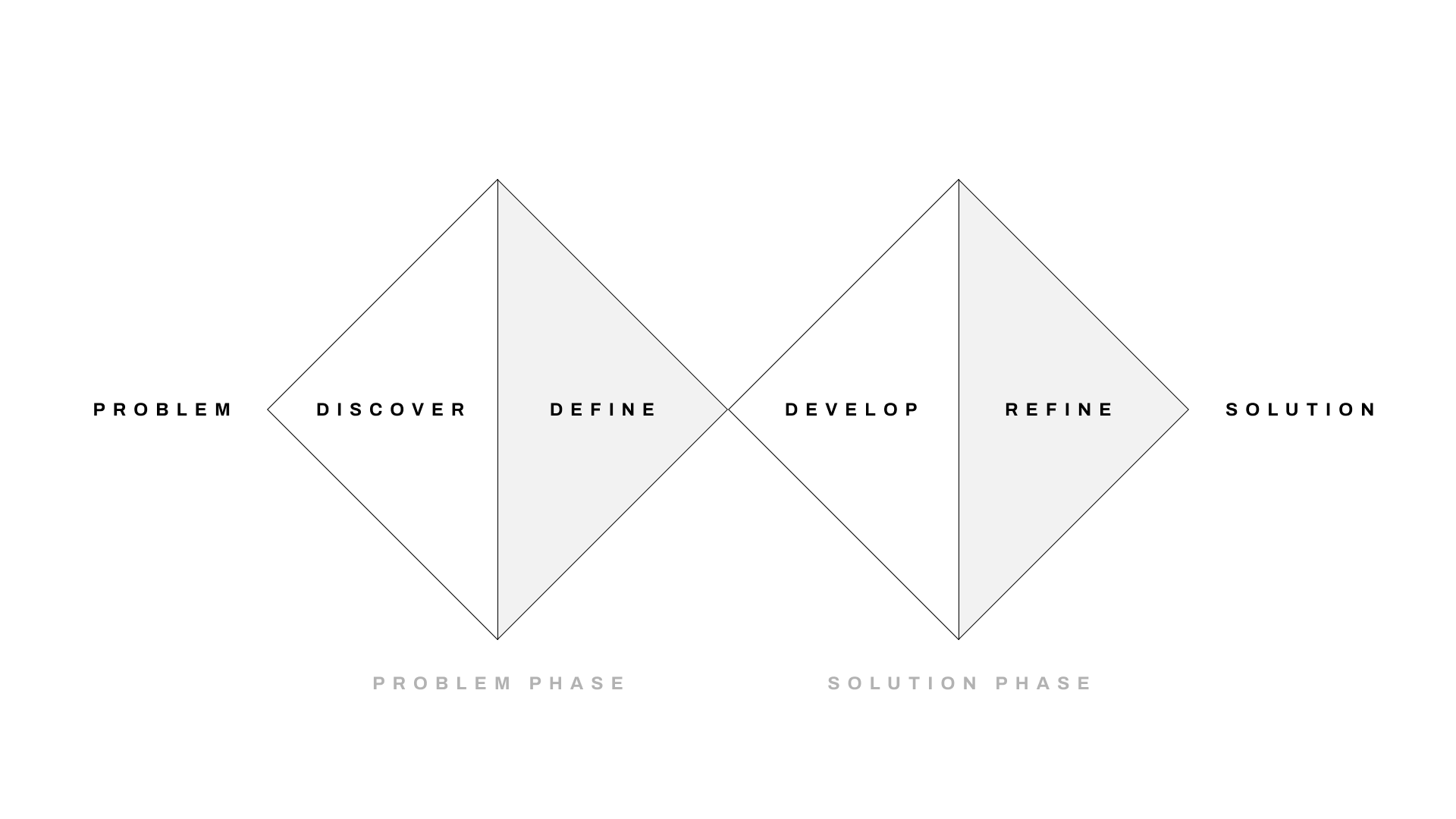
PROCESS
PROBLEM & OBJECTIVE
VTS has scaled and the business had expanded it’s product offering. The current design infrastructure needed to adjust to accommodate for user needs and the company’s product offering growth.
Team OBJECTIVE
Redesign the current navigation infrastructure to allow for growth, while creating a more focused workflow experience that makes way-finding and discovery simple and clear.
Business Objective
Product Scale + Reduce logo churn.
Key results
New infrastructure that allows for product offering growth.
85% user adoption of the new navigation experience.
“Things change often, I have to go hunting to find what I need.”
DISCOVER
By working with the CS and AM teams we started putting together a list of active users by persona types that we could reach out to and try get a deeper understanding of the issue. We were able to get 5 users of each of the following persona types.

PROBLEM PHASE
-
![]()
James Braun
Asset Manager
-
![]()
Janice Bowman
Landlord Rep. Broker
-
![]()
Bruno Sliverton
Owner / Executive


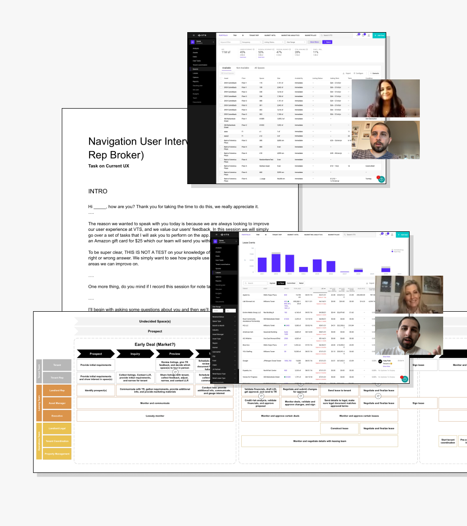
DISCOVERY
We reviewed our user journeys to keep them and our user personas top of mind. We then created a set of tasks we could have them do based on the jobs we were aware their specific role was involved in. All the tasks were aimed to understand if the user could navigate around the app and find primary and secondary level data, nothing beyond that. This way we could keep things honed at the navigation level and our team‘s domain.
We discovered that out of the 15 users, 29% of them, on average, were unable to discover 2-3 features or products related to their workflow.
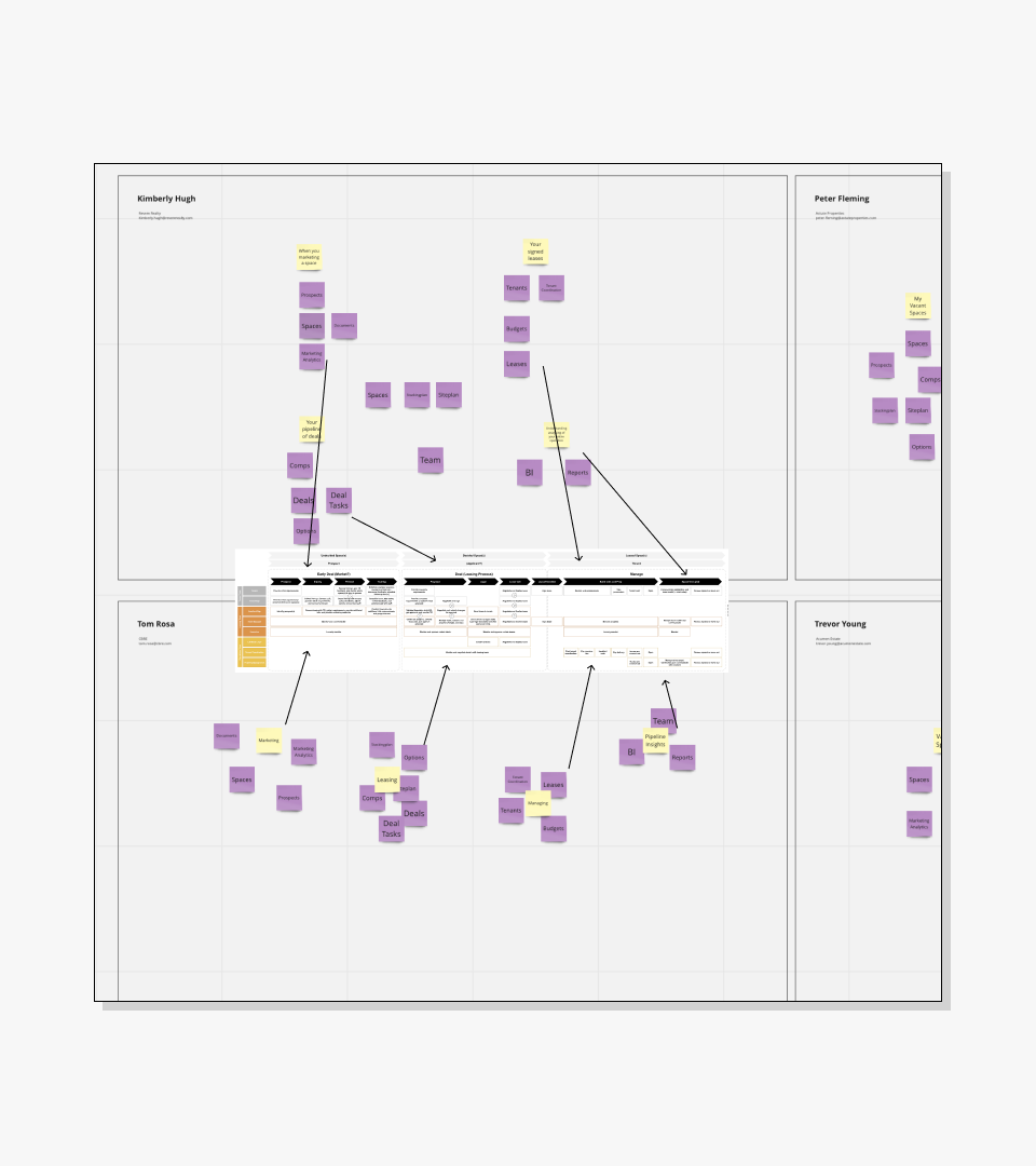
We also asked our users to do a card-sorting exercise to get a clearer mental model of how they saw the relationship amongst our products and features.
DEFINE
We needed a solution that would align with the user’s mental model in terms of how they saw the relationship amongst our products and features.
We discovered 3 key problem areas to focus on.
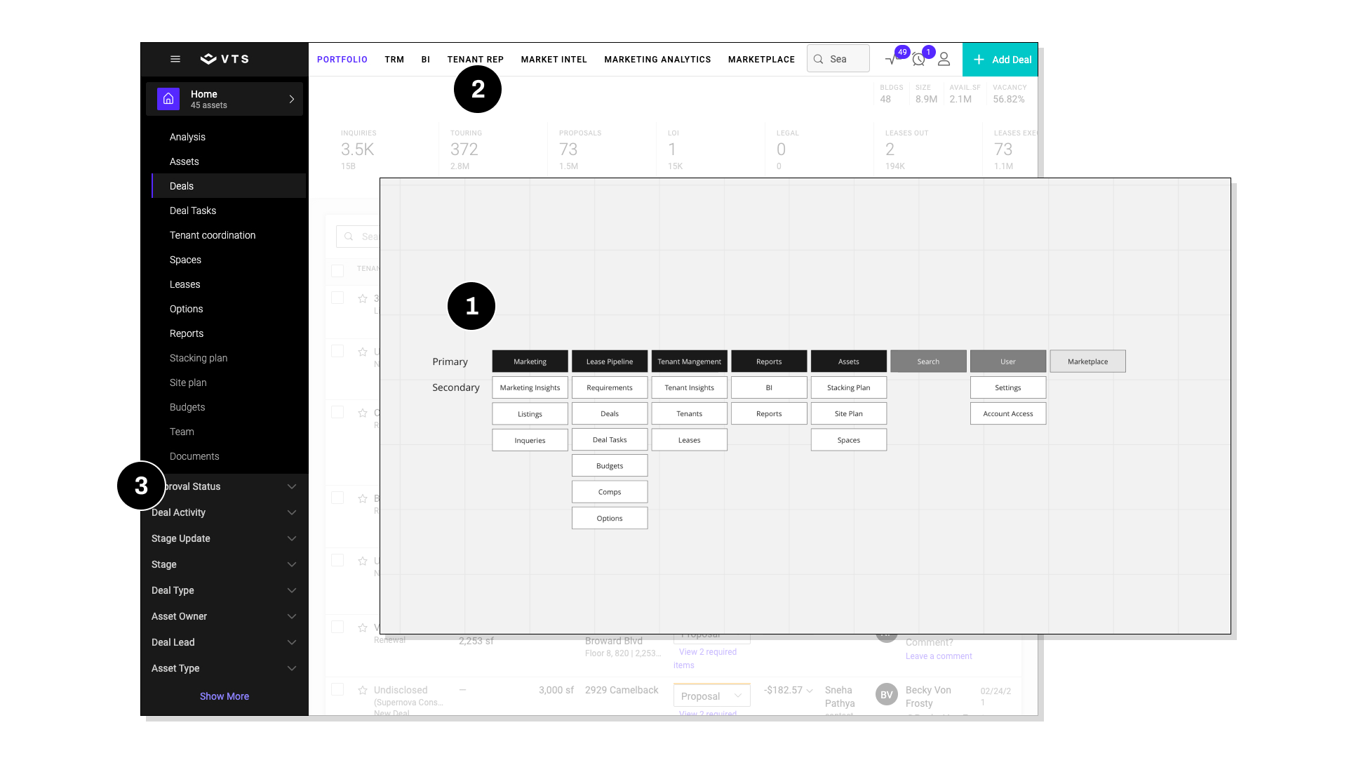
Job alignment: the navigation’s information architecture does not align with the user’s job domain or mental model.
Nomenclature: is unclear and it difficult to understand what tabs house what sub-content.
Functionality overloaded: filters are buried under secondary navigation and again makes them difficult to find and understand.

PROBLEM PHASE
DEVELOP
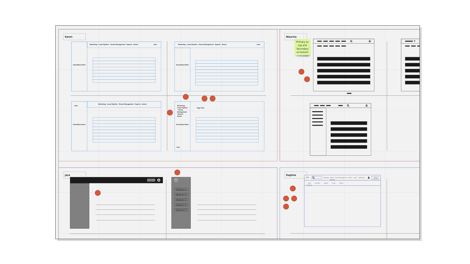
To start solutioning, I kicked things off with a mini 3 day design sprint. We brought in internal steak-holders and our team and shared our finding of the problem. The team sketched, voted, and we refined the agreed upon solution to create a prototype we could test with our users.

SOLUTION PHASE
REFINE
We went back to the original 15 users and asked them to perform the same tasks on the new prototype.
We were able to decrease the % of users who were unable to find products and features from 29% to 4%. We also got some additional feedback on our overall design from the users and stakeholders (CEO, CPO, DP, and PMs) and we fed it back into our design.

Solution PHASE
DEPLOY
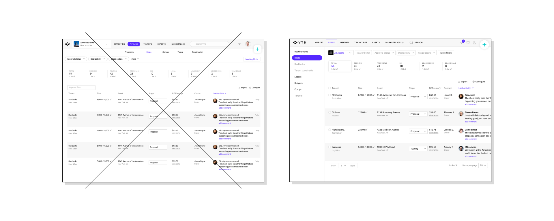
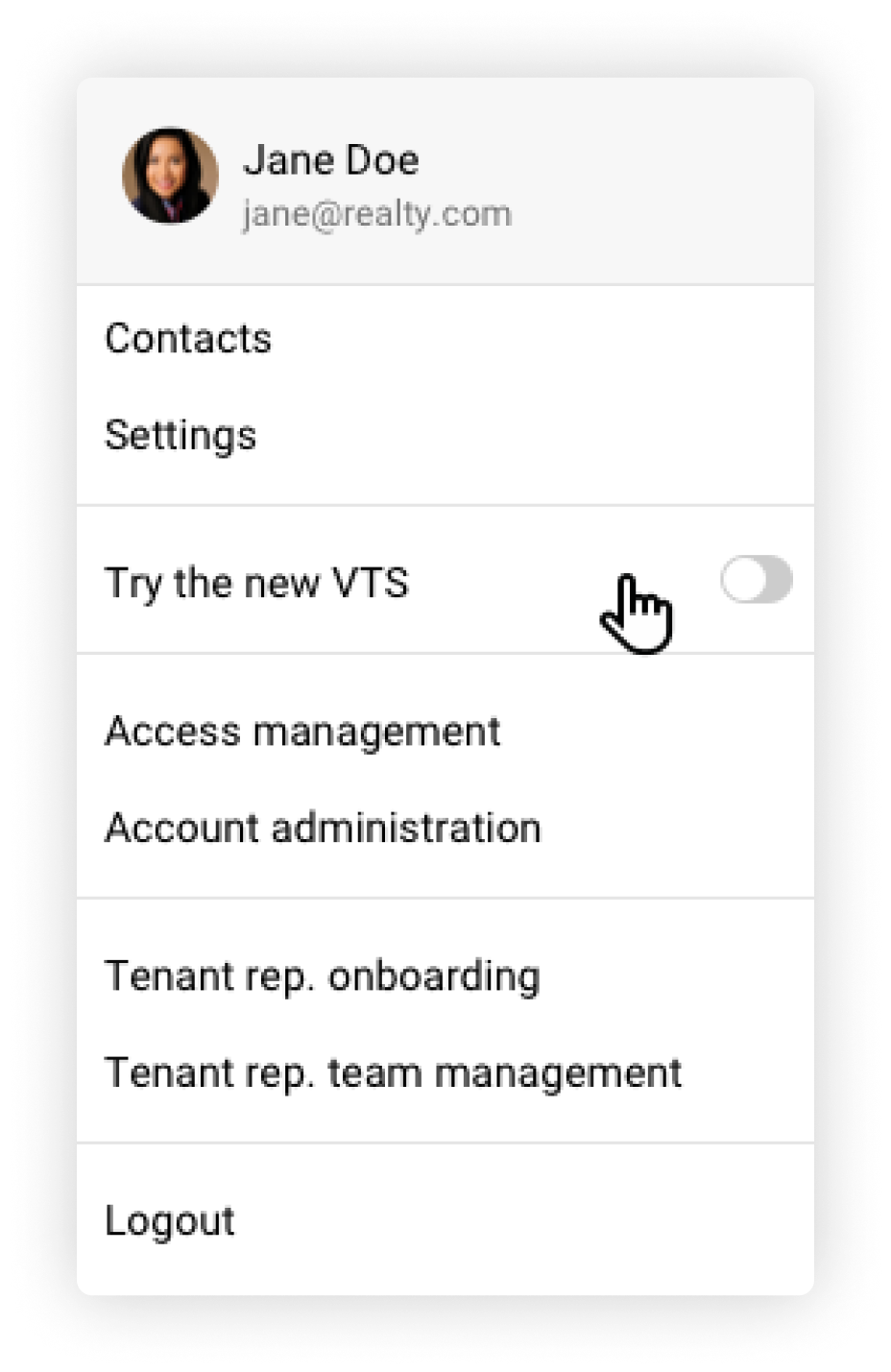
With the insights discovered through our testing, we refined the requirements and design. Working with my team we developed an MVP we felt comfortable to launch. To measure adoption, we put this new design on a feature flag, that users could opt in or out off through their user settings within the app.

RESULTS
95%
Client Adoption
As of today thing have greatly improved and we’ve hit our target results. Client adoption has been above what we expected and with the new design we are able to continue to grow the product offering.
100%
New Scalable Navigation
REFLECTION
If we could do things different, there would be some areas we could have improved or spent more time on. These would be:
Testing the migration of filters with users was an area we didn’t focus as much as we could have.
We should have pushed for a more meaningful launch that could have been coupled with other initiatives, that could have positioned us to launch is as a new system version. “VTS 3.0”.