FORTE
CLIENT PLATFORM BRANDING
Forte — a white-label SaSS fitness platform for live and on-demand streaming.
UX Research / UI/UX Design / Product Management / Creative Direction / Art Direction
Forte’s onboarding process is the first crucial step for a client to launch a branded platform and begin offering it to it’s members. It is the step the allows for a client to apply its brand elements such as: logo, colors, and visuals to make the platform an extension of their brand.
Despite Forte’s success, the on-boarding process for launching a new client is relatively lengthy, tedious and labor intensive for both the client and the Forte team. It eats up a lot of internal resources, taking about 2 weeks of their time to spin up a new instance, brand it, and apply any custom changes the client requests. This causes a physical strain on the team, and makes it very difficult for the business to scale.
PROBLEM & OBJECTIVE
Design Objective
I wanted to design a solution for the internal Forte team to easily launch a new platform for a client, as well as design a self-serve solution for clients to control the onboarding branding portion of the process; and thus reduce the amount of Forte’s team time needed to launch a new client.
Aligned Business Objective
Create True SaSS platform that allows for the business to scale.
Target Results
100% removal of the design and frontend development team from the branding on-boarding process.
50% reduction in time to launch a client’s branded platform
Create true scalable SaSS platform
MY ROLE & TEAM
As lead designer on this project, I owned the strategy, design and project management end to end. I worked closely with a wonderful cross-functional team of steak-holders which included our CEO, CTO, Head of CS, Head of Content, Engineering, and QA.
My Role
UX Researcher / UI/UX Design / Product Management / Creative Direction / Art Direction
Core Team
Aldrich R. (Lead Engineer), Vitaly I. (Front End Engineer), Costa C. (Backend Engineer), Nasir A. (QA)
PROCESS

PROBLEM DISCOVERY
UNDERSTANDING
THE PAIN
To understand the problem more in depth, I conducted a set of discovery sessions to gain a better understanding of the current flow of the process and to understand the user’s pains along the way. This included talking to the; Head of Client Success, the Visual Designer, the Lead Front-end Engineer, and 5 client admins from our most recently onboarded clients. Beforehand, I prepared a set of questions beforehand to ask them during the calls.
“If we were to get 10 new clients today we could not handle it...”
Forte Team Discovery
I had each team member walk me to their part of the process and highlight any areas they felt were the most painful. This helped me gain a better, more in-depth understanding of the process internally and hear first hand the pains each team member had along the way.
Key Findings
Team spends on average of 2 weeks of time launching a new client.
Spinning up a new instance of the platform is a manual process.
There are no style guidelines for the client to follow.
There is a lot of time spent on mock up approvals.
Applying style requests is very manual and time consuming for the front-end engineer.
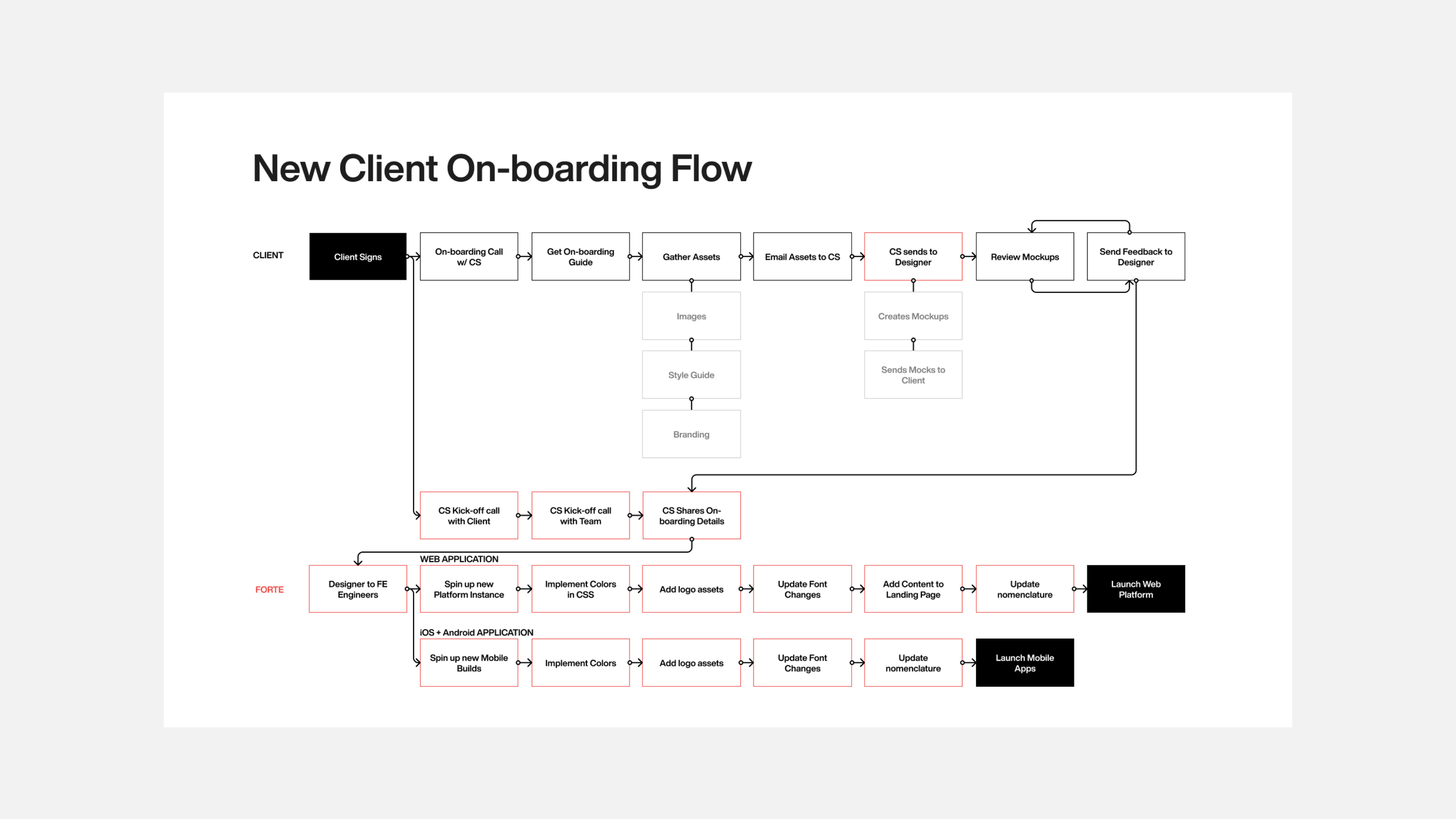
Current On-boarding Flow
After documenting the findings, I put together a flow map to help visually understand the entire process, from a client being signed to their platform launching. This helped me and the team see the flow visually and the amount of involvement from the team the process required.
Client Discovery
Working with the CEO and Head of CS, I gathered a list of 5 different size clients along with the contact info of the person that had been tasked to do this part of the process. I reached out to each client and scheduled calls. I had each client admin walk me through their experience, using the flow map as a guide. I asked them to give me insight on how the whole process was for them as whole and what areas they felt were the most painful along the way.
Key Findings
Clients felt the process was a bit strenuous as they felt at times very pressured by the CS team to gather assets.
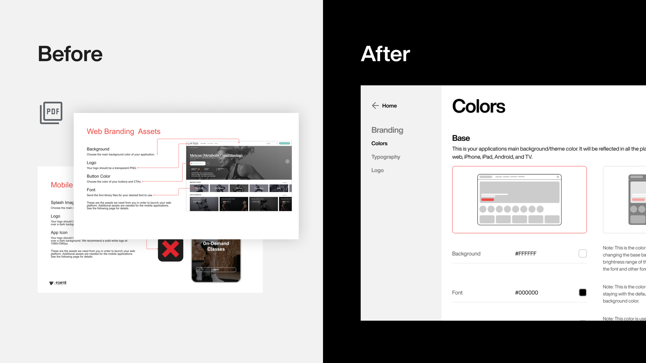
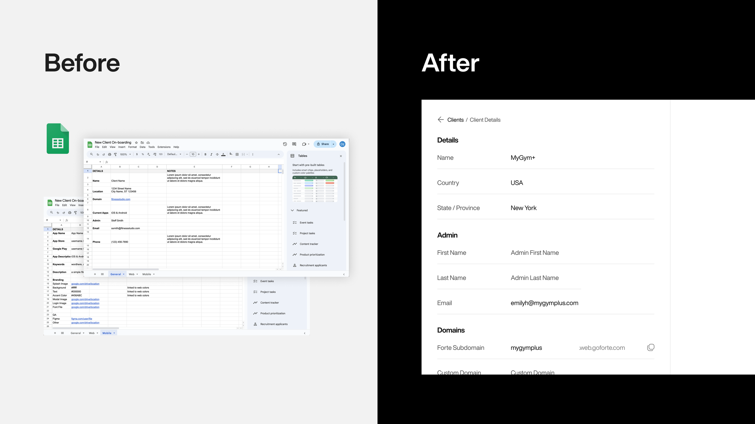
Even though there was a PDF guide, most didn’t really refer back to it, so they felt that a lot of time was spent figuring out the specific asset requirements needed, such as sizing and colors of a logo, font files, app icon, imagery, etc.
After their platform was launched, they felt uncertain to ask for updates as they didn’t want the process to take as long as it did initially.
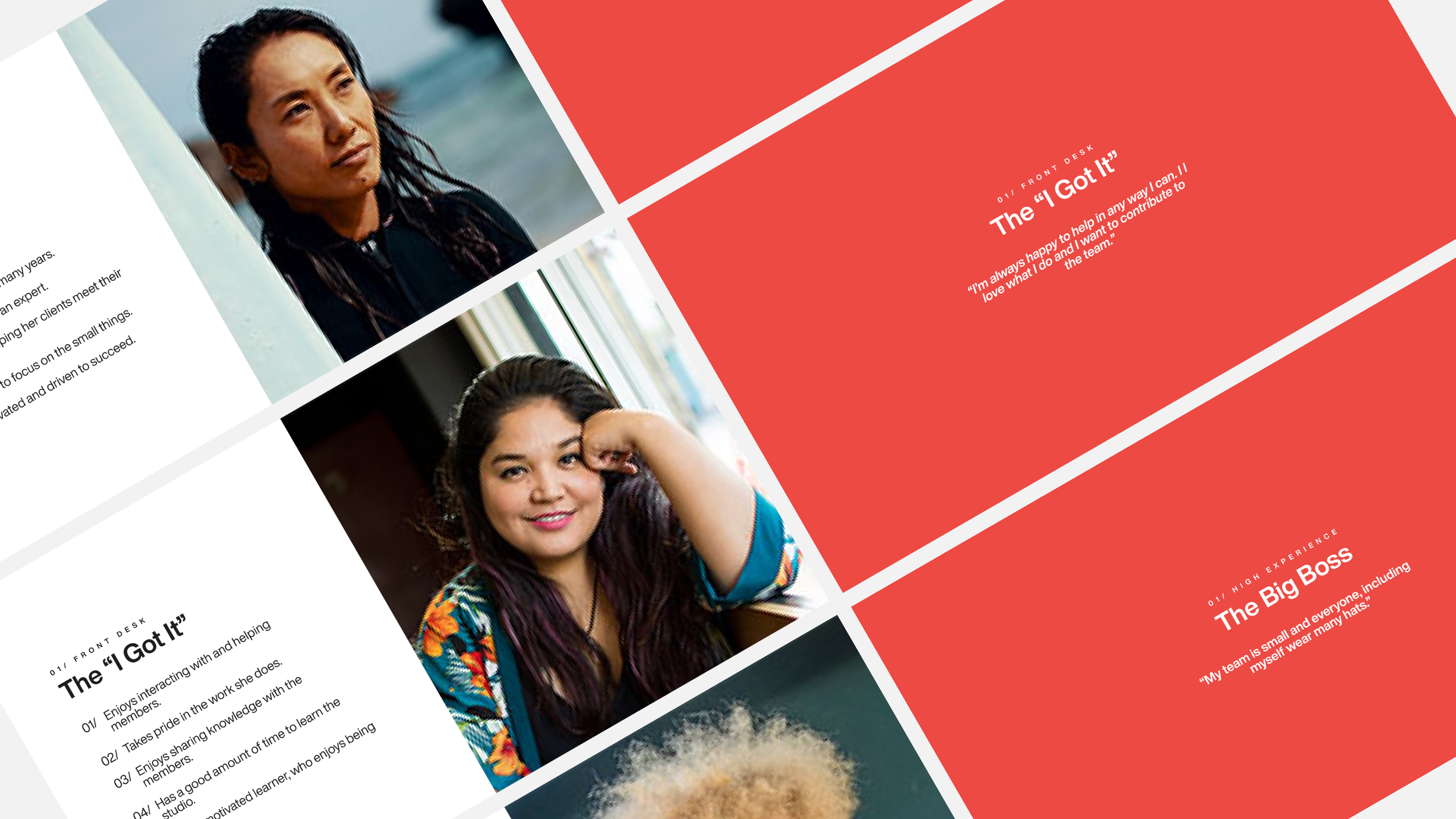
Understanding the User
Additionally, with the data I collected, I was able to create generalized persona profiles that I could use throughout this an other projects. These included:
The Big Boss: Usually the owner or manager of a small to medium size studio or gym.
The “I Got It”: A front desk staff member that is there to welcome members and answer any questions, but is also asked to do ad-hock tasks.
The Coach: This user is an instructor or coach for the client, they tend to add content or schedule their class offerings.

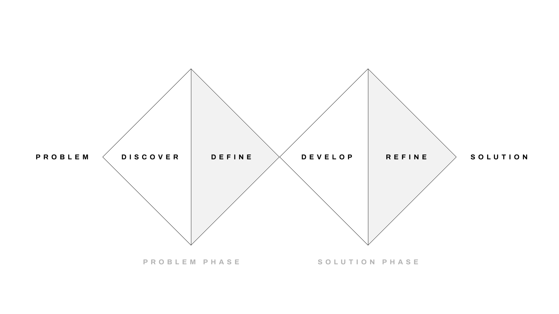
PROBLEM PHASE
DEFINE
I gathered my key findings and documented them as I prepared artifacts for the solution discovery phase. We needed a solution that would reduce or completely eliminate the involvement of our team from this process. We also need a solution that would make the process easy for the client.

SOLUTION PHASE
DEVELOP
With my findings and a clearer understanding of the problem and pain points, I brought the team together for a design thinking workshop to come up with initial requirements and a design direction for an initial prototype. I began by presenting the key findings of the discovery sessions, the design system direction (see overview below), and explaining the business goals. We then aligned on project goals and finally we brainstormed potential solutions.
Design Prerequisite
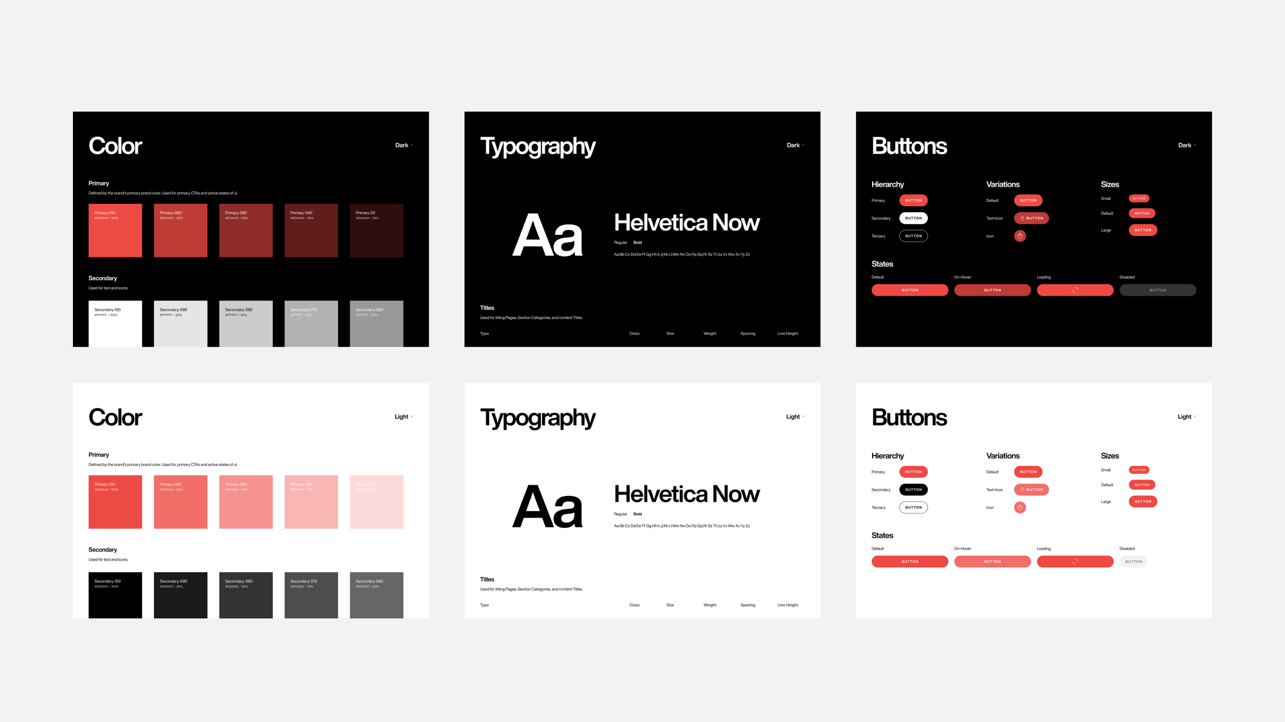
In order to create a solution that allow clients to customize their apps based on their brand guidelines, we first needed to create a design system that would allow for that flexibility.
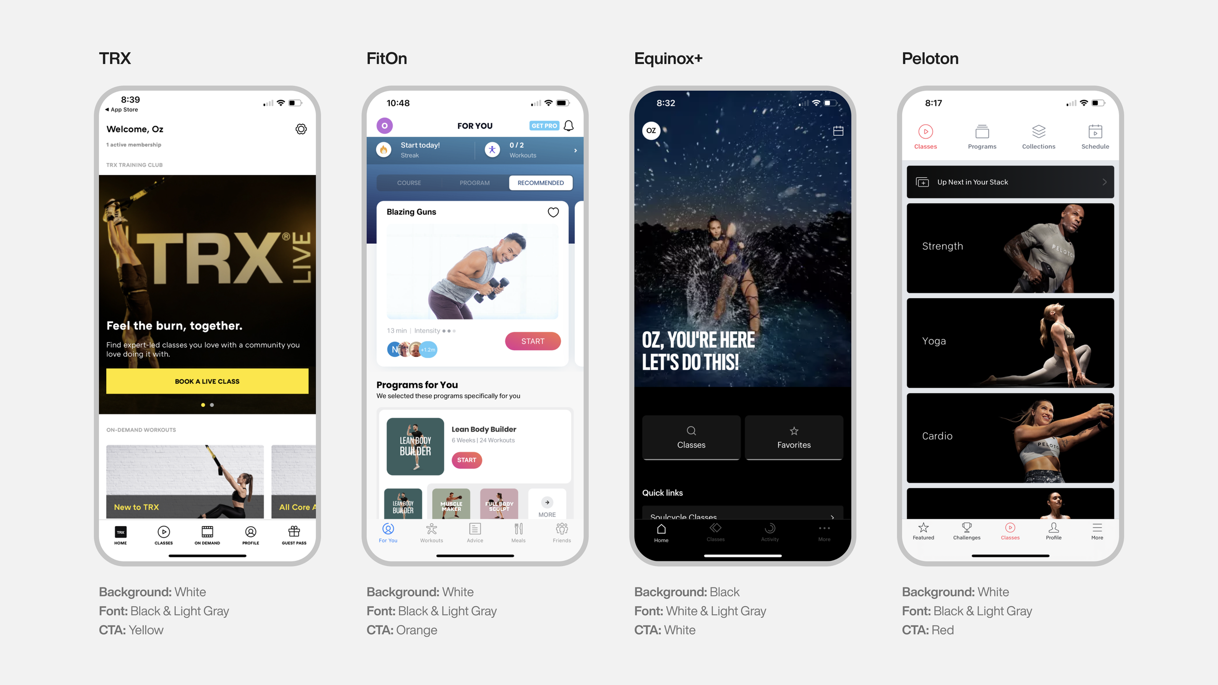
Competitive Analysis
To begin the work I first did competitive analysis research to see what color patterns brands use to brand their apps. The researched revealed that most popular fitness apps follow a similar color pattern.
Key Findings
Background: Most applications use either White or Black.
Font Color: The font color is either Black or White depending on the background color.
Font Family: A legible font such as Helvetica, Roboto, Avenir or something similar.
CTAs: This color is usually the brand’s primary color. This is what mainly ties the
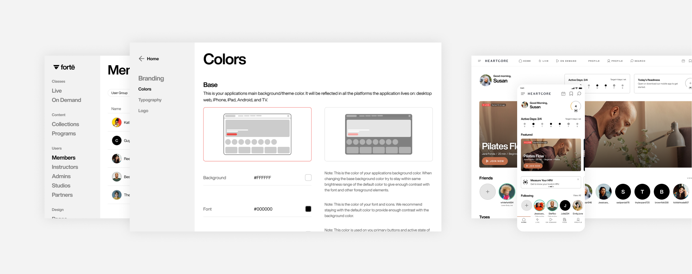
Push Design System
The result is Push, a simple theme-able design system. It allows Client’s the ability to select their app’s base background color, light or dark, a font color, and a primary color for CTAs. View the Push Case Study summary for additional details.

SOLUTION PHASE
TEST & REFINE
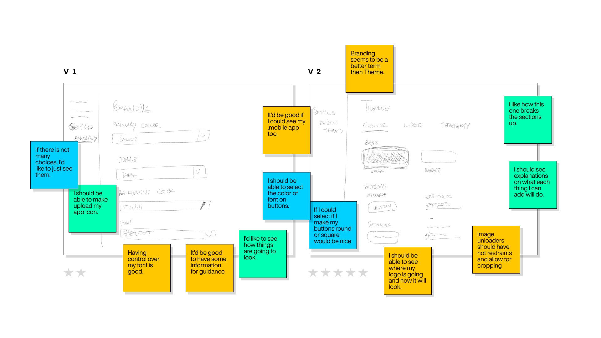
With the a solution direction in place and the design system created, I quickly designed a working prototype to put in front the 5 client platform admins that I had the discovery sessions with. In addition, I created a set of tasks for them to execute on the prototype such as: changing the main background color of the app, changing the color of the primary button, changing title font, and adding their logo. These sessions gave me insights on what tasks the users found difficult to do or accomplish and what things they found difficult to understand.

Key Findings
Unclear what each option/change would result in on the actual apps.
It was unclear how to remove or replace images.
Would like option to change button style.
Would like more options for adjusting typography.
What Went Well
Overall, clients felt the overall process was simpler then the current one.
The enjoyed that the process was all in one place as appose to the having the PDF and emailing the assets to the Forte CS team.
The liked that they could easily go back and make changes which was something they felt hesitant to do in the old process.
DEPLOY
I took the findings from the prototype testing sessions and then went back to the design to incorporate the feedback I received. I then had a series of sessions with my team to review the final designs.
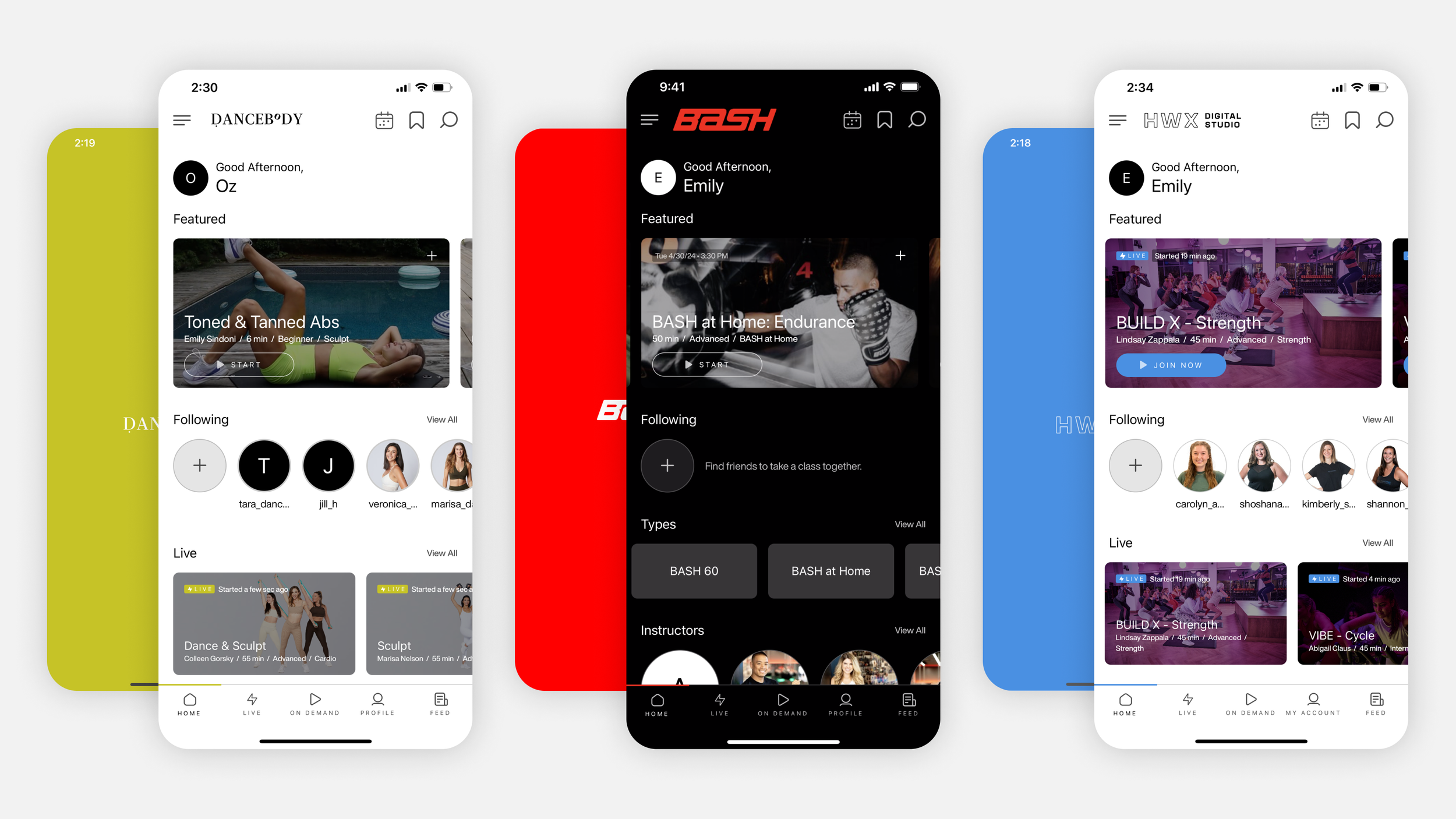
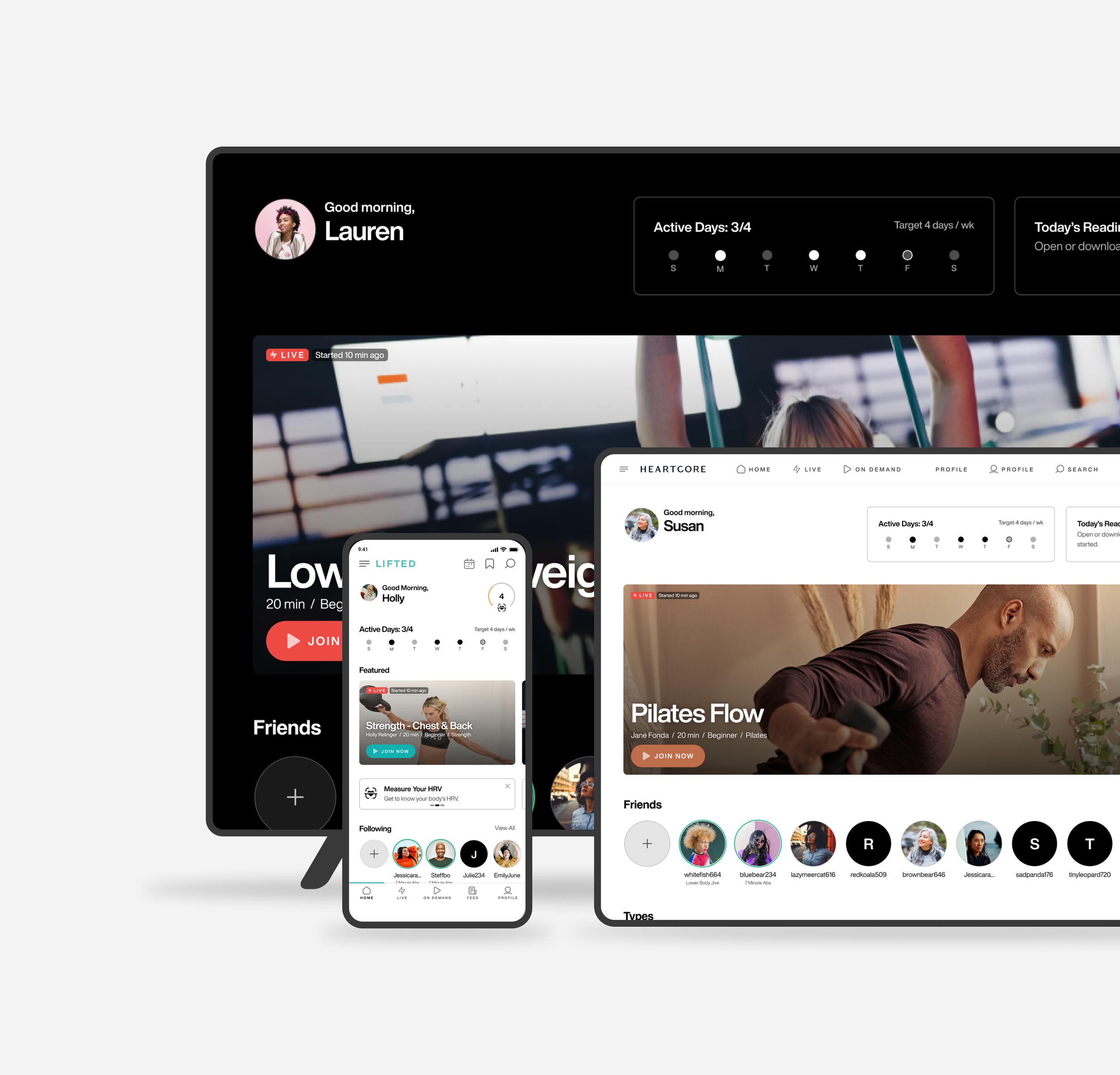
The outcome: a simple and intuitive CMS solution that allows the client to brand their app as they pleased. By selecting a base theme to start with, applying a brand color to primary elements and adding their brand’s logo to the different platforms, the app adapts to their brand.
Branding Process
New Client Platform Launching Process
REFLECTION
If there was something I would like to do next time around in the upcoming updates is to spend more time on the interaction design. Due to time constraints set forth by the board, there were things we had to sacrifice for this feature and all those features involved in the entirety of the app redesign project in order to meet deadlines. Interaction design is one design layer that adds a lot of value to an application, especially in B2C applications as it adds clarity and provides delight to a user.